|
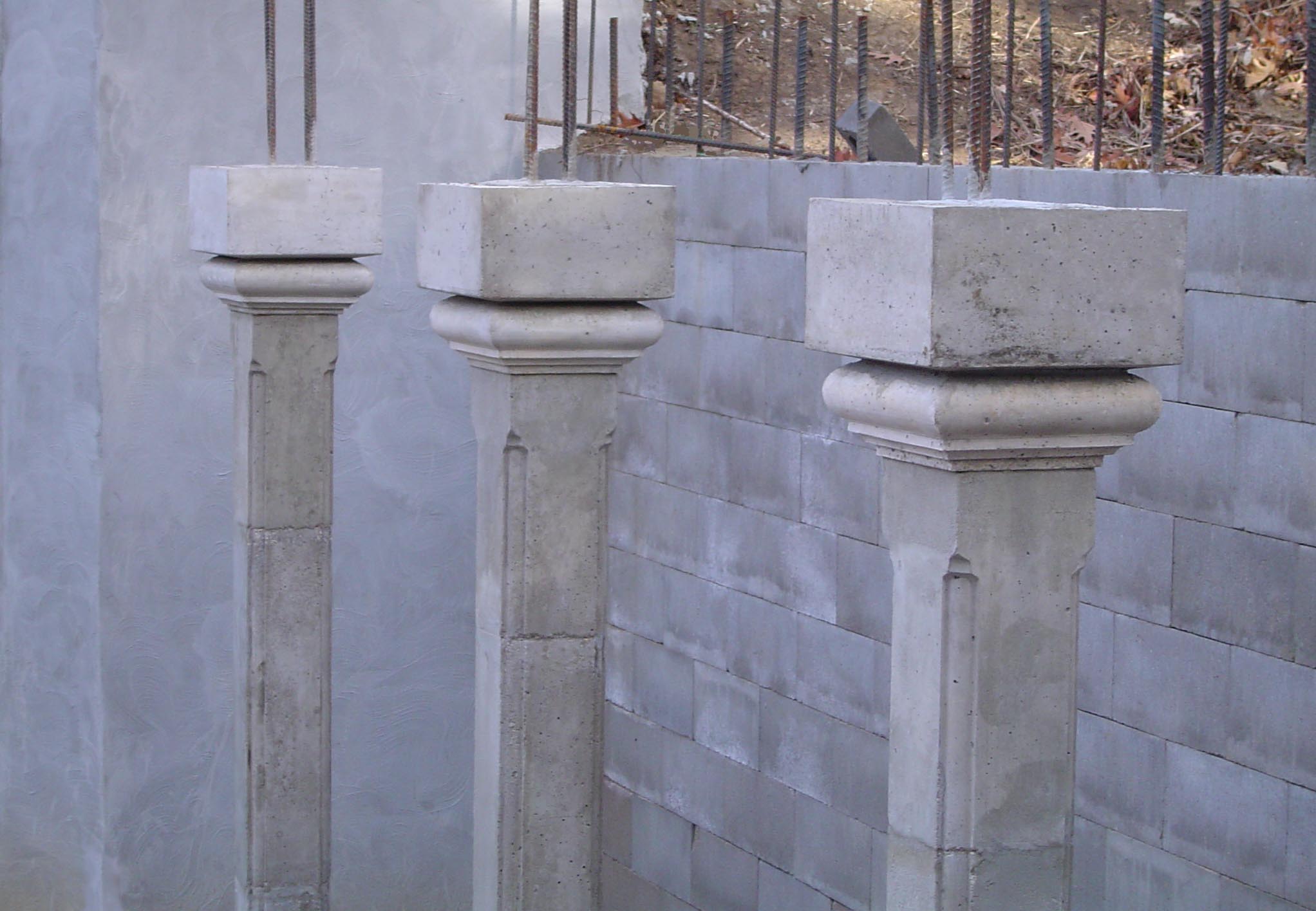
The chance to design and build some columns arose when a friend who is
becoming a home builder wanted something special on his own house.
Starting with the concept similar to my bannister, there is one major difference,
these columns will support some weight.
When I first saw the plans, I was asked to come up with some ideas about
a ballustrade. I drew an elaborate image, which, when it came right down to
it, I am glad we did not try to proceed with. The setting is much more intimate
and woodsy, but at the time, I had not seen the site.
Once again, the reality of creating something in the real world helps keep us
in balance. It was alot of work to create three 8' columns.
|
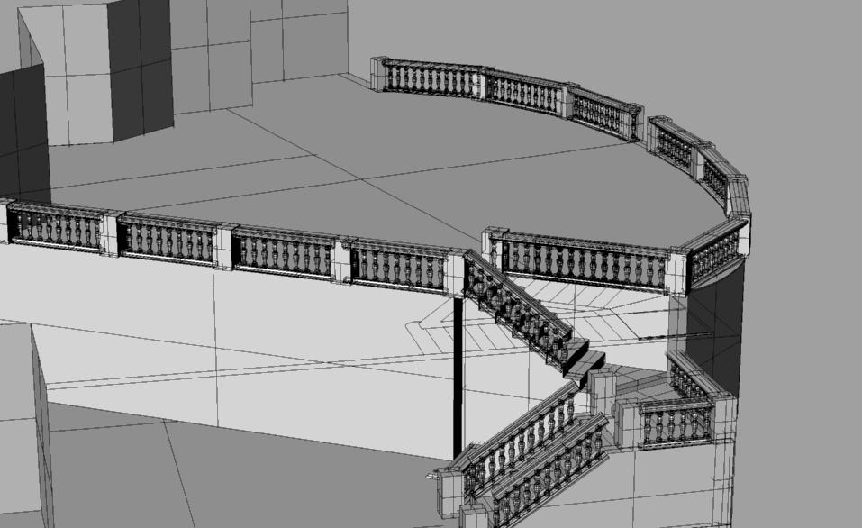
Originally, the area was to be quite elaborate
|
With an 8" slab over the 20' by 5' area, I calculated the load to be roughly 1/25 of what these
three 7" square columns could support ( in the worst case -- with 100 two hundred pound men standing there), so after functionality issues are resolved, aesthetics come into play.
Just about anyone who gazes upon a structure of any sort can get a sense of what is just 'right' about it.
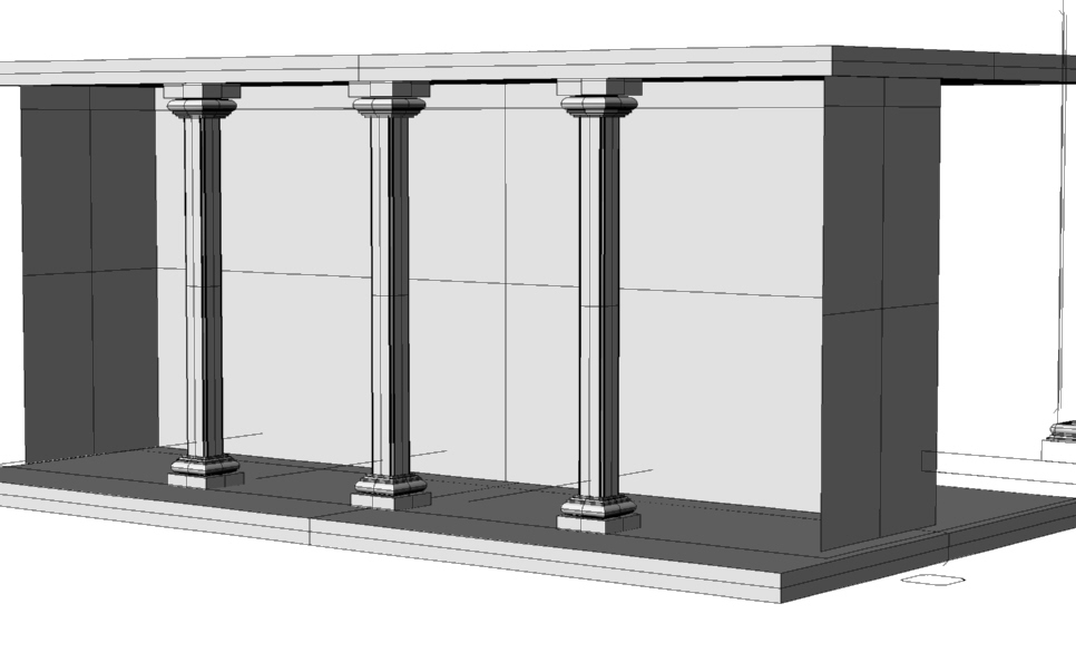
In the case of this column design, I did'nt want too skinny, too fat, too top heavy, bottom heavy, ornate, or
too anything. What is great about the digital age is that we can create computer model pretty quickly and
render it in the space.
I would love to have 10000 people vote on what looks good and what doesn't and I would bet that the
results would be telling for many designers. Columns are things that men have been building from day one of
history. After this project, I can see why. There is something very satisfying about a simple column and what
it represents -- strength, shelter.
|
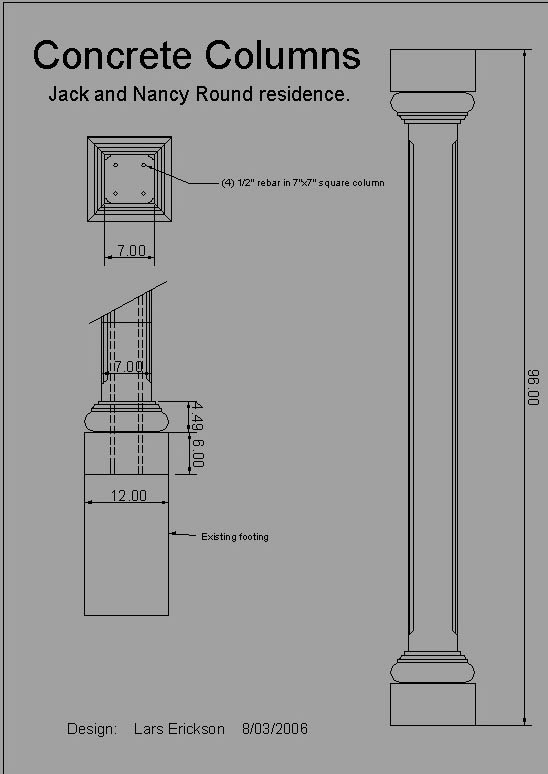
A design spec.
|
|
I decided to draw the 8' column in scale with the base and top to get a sense of what the correct size of
capital and base would be. There are three basic pieces, a square base, a rounded edge square on top ( and below)
and a column in the middle.
|
Construction.
|
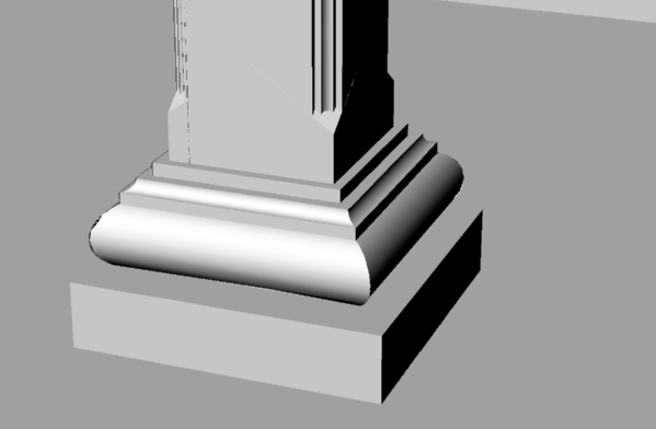
| I had already used a radius of this size on a different project and it occured to me that a half circle just
protruded too much. In fact, on the project I used it for, much detail is obscured by a 'too prominent' bull nose. So,
on these base and capitals, I wanted to use less than a half circle in the cross section of the curved edge. What a
tiny detail, but it makes a difference in the end. It also makes it more difficult to construct the form! ( mostly
because the angle is not from, say, 0 to 180 reduced to 20 to 160, it is more like from 0 to 140, which gives it a more graceful curve.
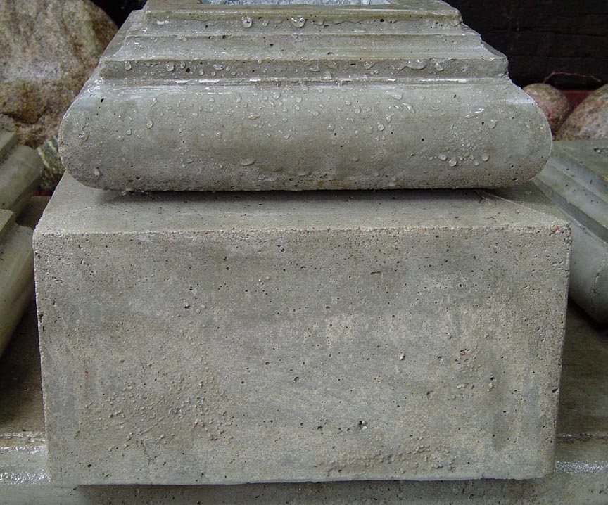
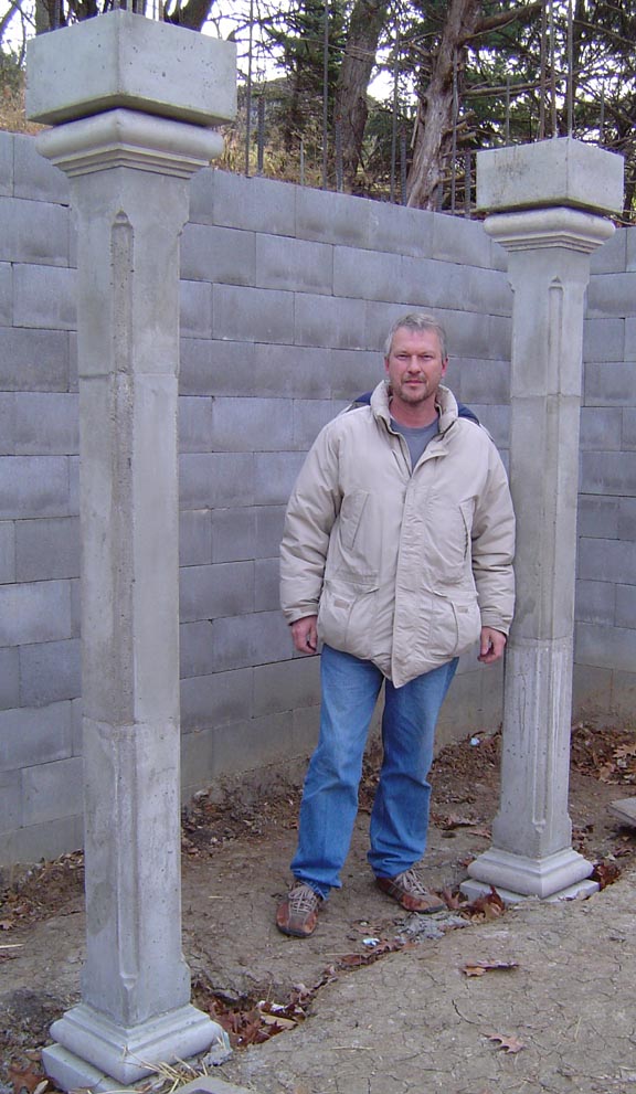
The implementation of these columns proceeded with the usual cursing of voids, vibrating of mixes, and patching afterwards. Concrete can last a lifetime, or several, so it is nice to make it look good, but I am not a fan of
perfection. As I make these structures, I really enjoyed hearing the remark that you can't tell if they were made
recently or years ago.
|
|
As of now, the house is still incomplete, but when the grade is cleared away, the homeowners will be able to see
their names cast on each base.
|
|

 Lars' Creative Warehouse

 Lars' Creative Warehouse